Digital asset management home page redesign
We wanted to design a fresh new home page where people can find the content they need more easily, visually it should be more polished yet the page should look familiar. Additionally, create a solid foundation for future improvements.
Overview
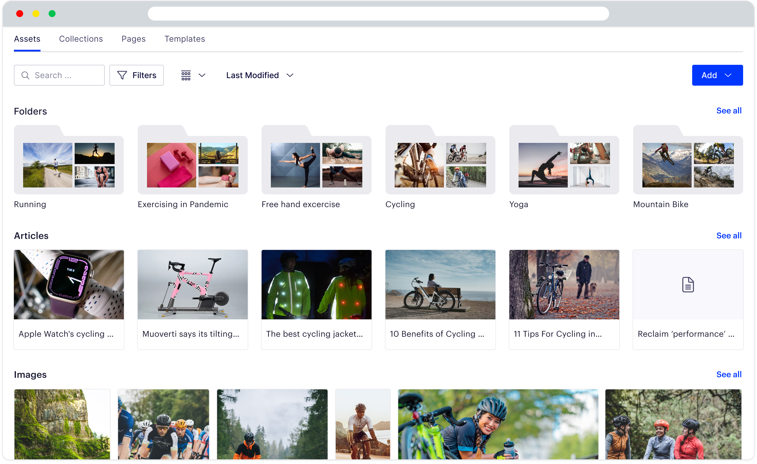
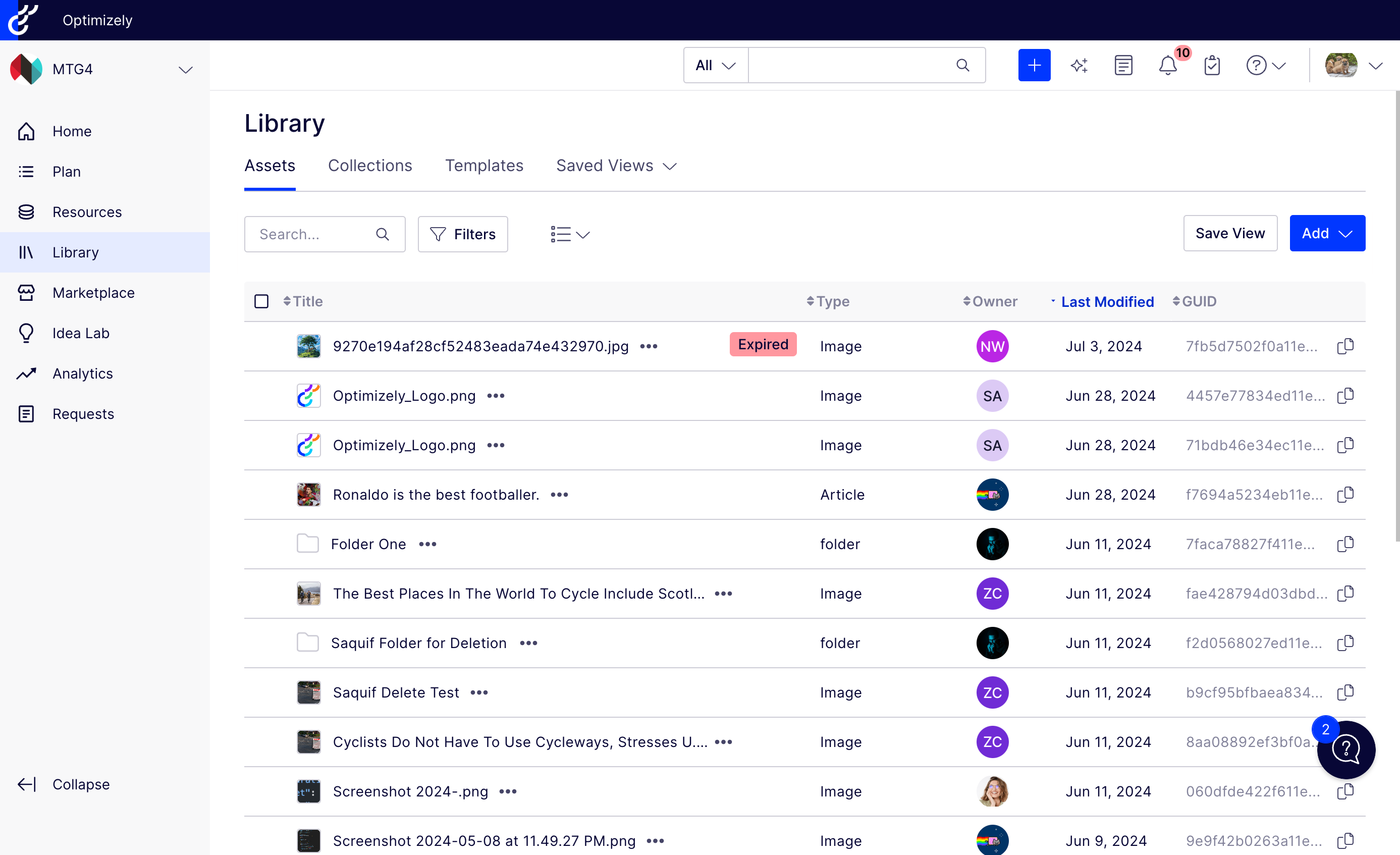
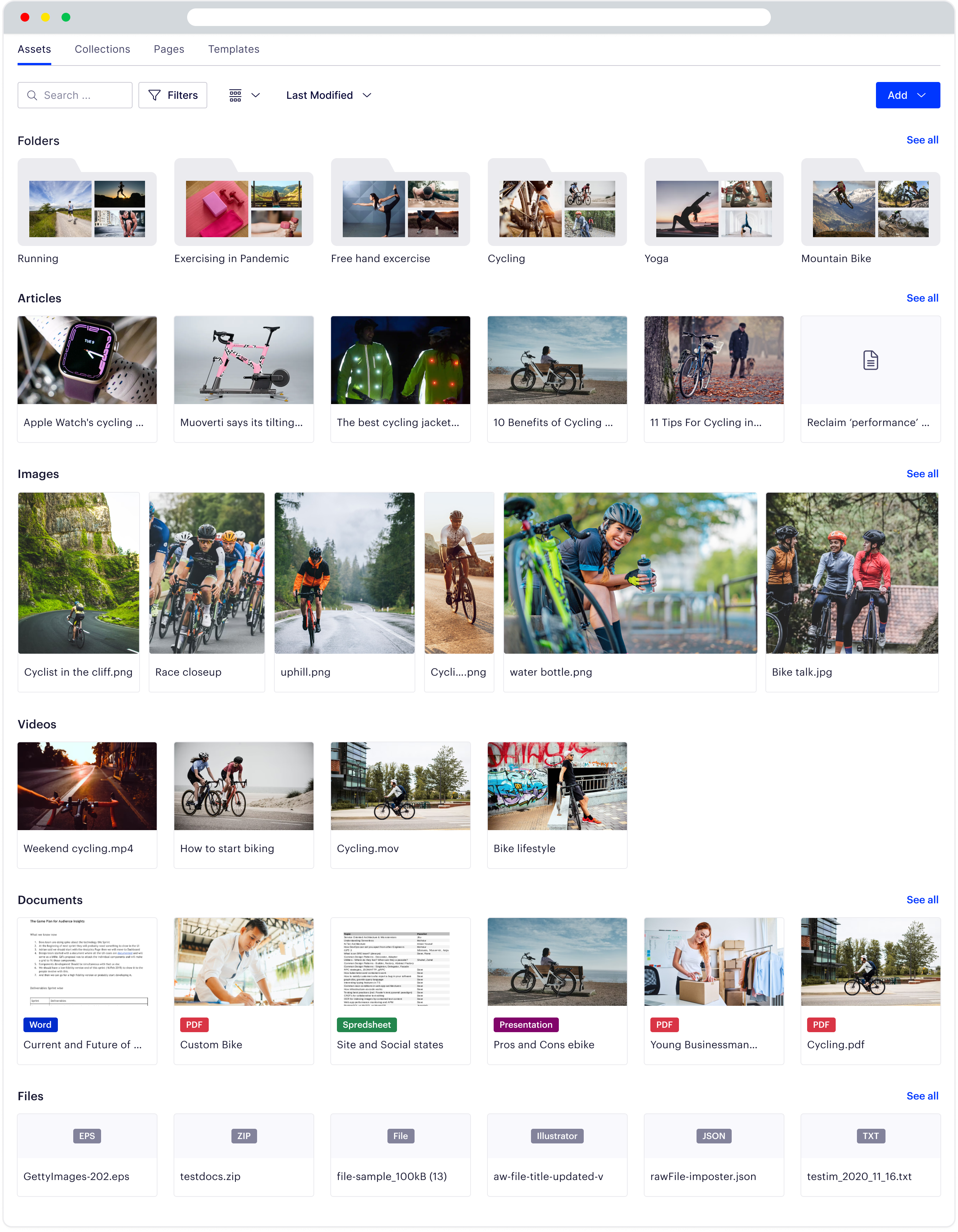
Users struggle to easily find the assets they want to use, moreover they want to see the folder’s content without opening it. Sometimes they want to search and find assets to use on and off platform.
Our DAM (Digital Assets Management) users are increasing, navigating through folders become a pain point for them because we were showing a flat structure and default sorting was based on creation date. More people making assets force the folder to go deep in the page.
Finally, we needed a wow factor for the marketing team’s demos, and pave the way for future improvements of the product.
Roles & Process
Like previous work, I lead the design effort for the DAM team. We are an agile team consisting of 4/5 developers, one product manager, and one designer.
In our organization, all designers meet weekly to discuss design problems. We have a couple of small teams for each product area, all product manager and designer meet weekly to discuss dependency or review of new features.
Research
We looked into the various competitor’s products, and some B2C applications. Most importantly we interviewed some of our users about how they want to see the product in the future. Most of these meetings were conducted by an account manager along with a product manager, and in some cases included myself.
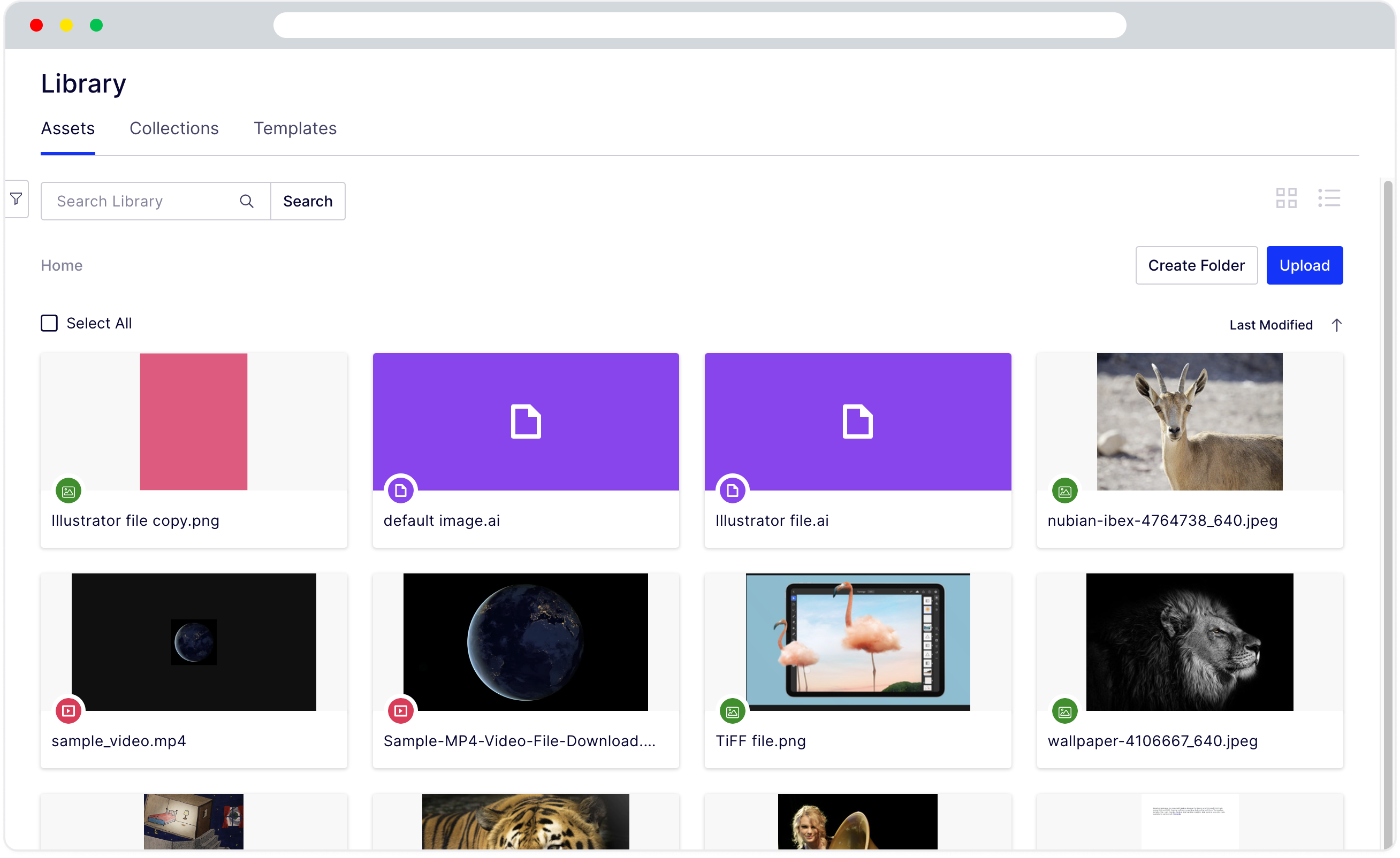
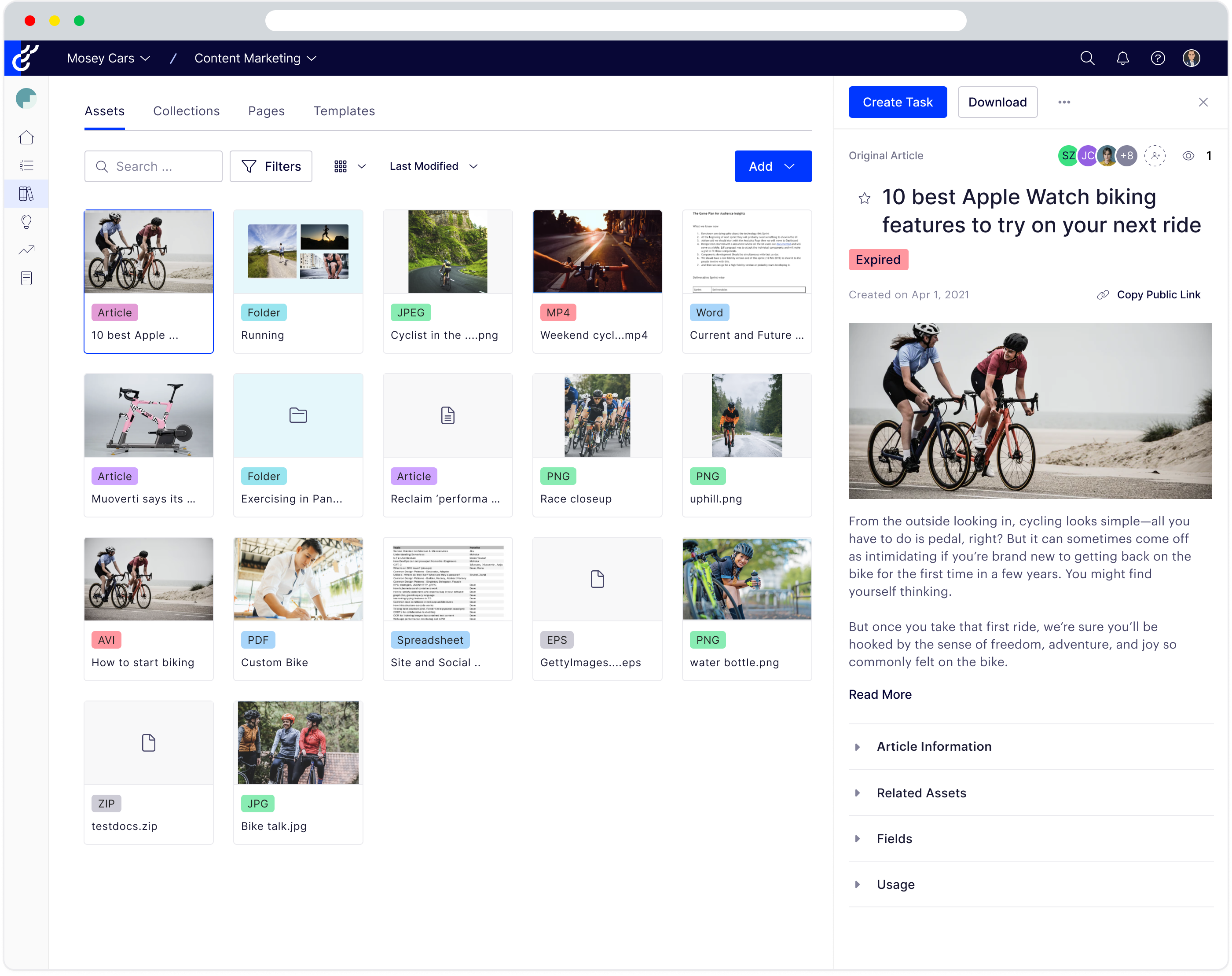
Some of the features e.g. folder preview were long-wanted. Additionally our assets cards were old and we needed a way to make those better.
Solution
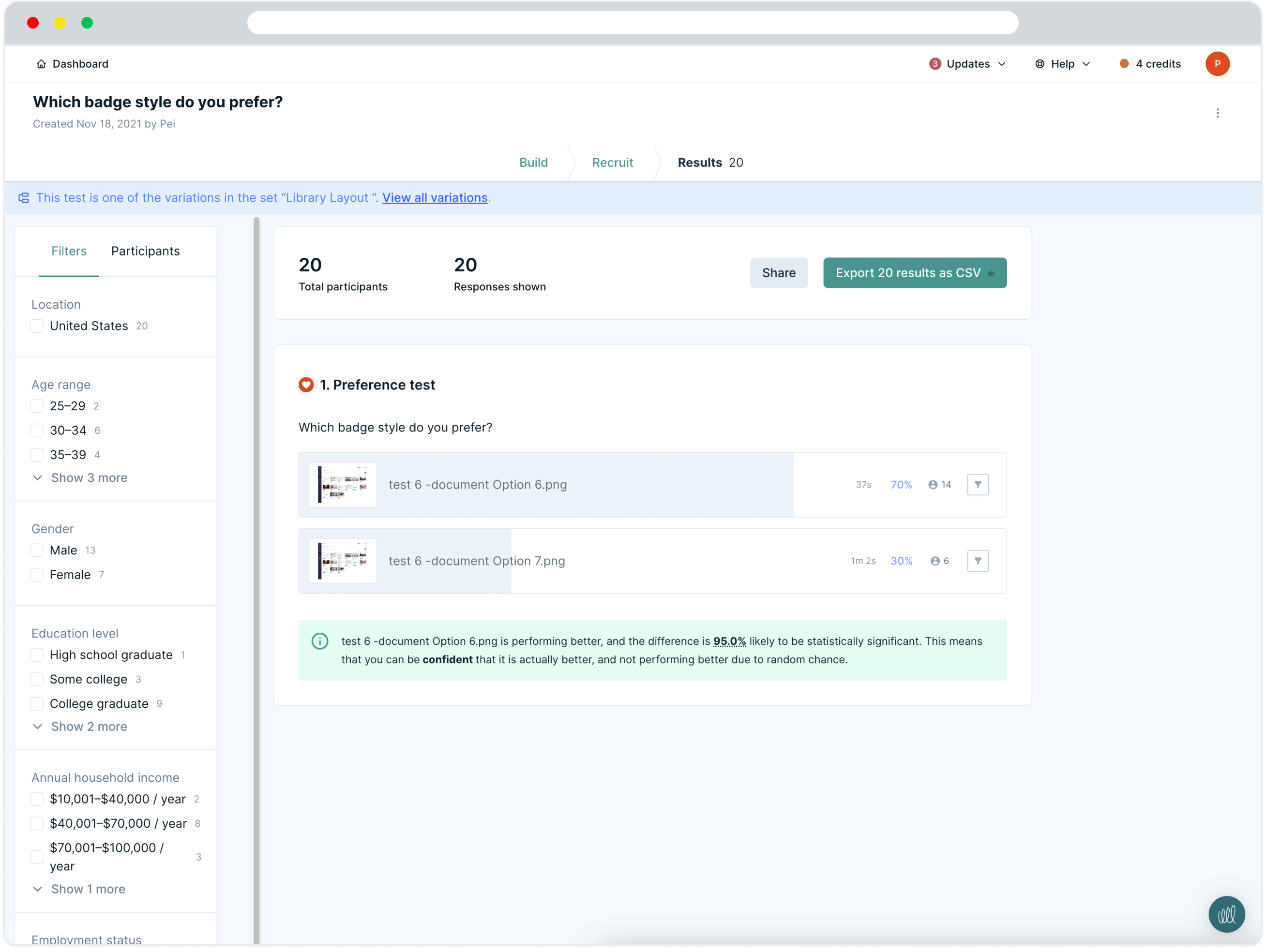
Our hypothesis was to create a category based home page along with a bigger display for images. We wanted to test it. Since it was a B2B software there weren't enough users to run A/B tests and most of the users are busy executives, so we wanted to test the hypothesis without disturbing them.
We tried a preference test. It has some drawbacks compared to an A/B test, but we chose it because we needed early feedback. For preference tests, we used a web-based tool called Lyssna [formally UsabilityHub]. It lets you hire people for tests based on different demographics. We tested following items
- Folder view
- Card hover between two designs
- Image display
- Badge Style
- Badge or Logo
Furthermore, we had the page designs ready. We added the necessary parts for the test and kept everything else the same to make sure our data stayed clean.
We tried a preference test. It has some drawbacks compared to an A/B test, but we chose it because we needed early feedback. For preference tests, we use a web-based tool called UsabilityHub. It's a service that provides a panel of different demographics to quickly validate our design. We tested all our small hypotheses, like card style and badge positioning.
Now we needed to test the full page design. We chose a preference test again. Since it's hard for our users to go to UsabilityHub, we needed a way to do it in our software. Luckily, we found a way. We used a web app called Gainsight PX for the NPS survey. We decided to use the platform and modify the survey to fit our test.
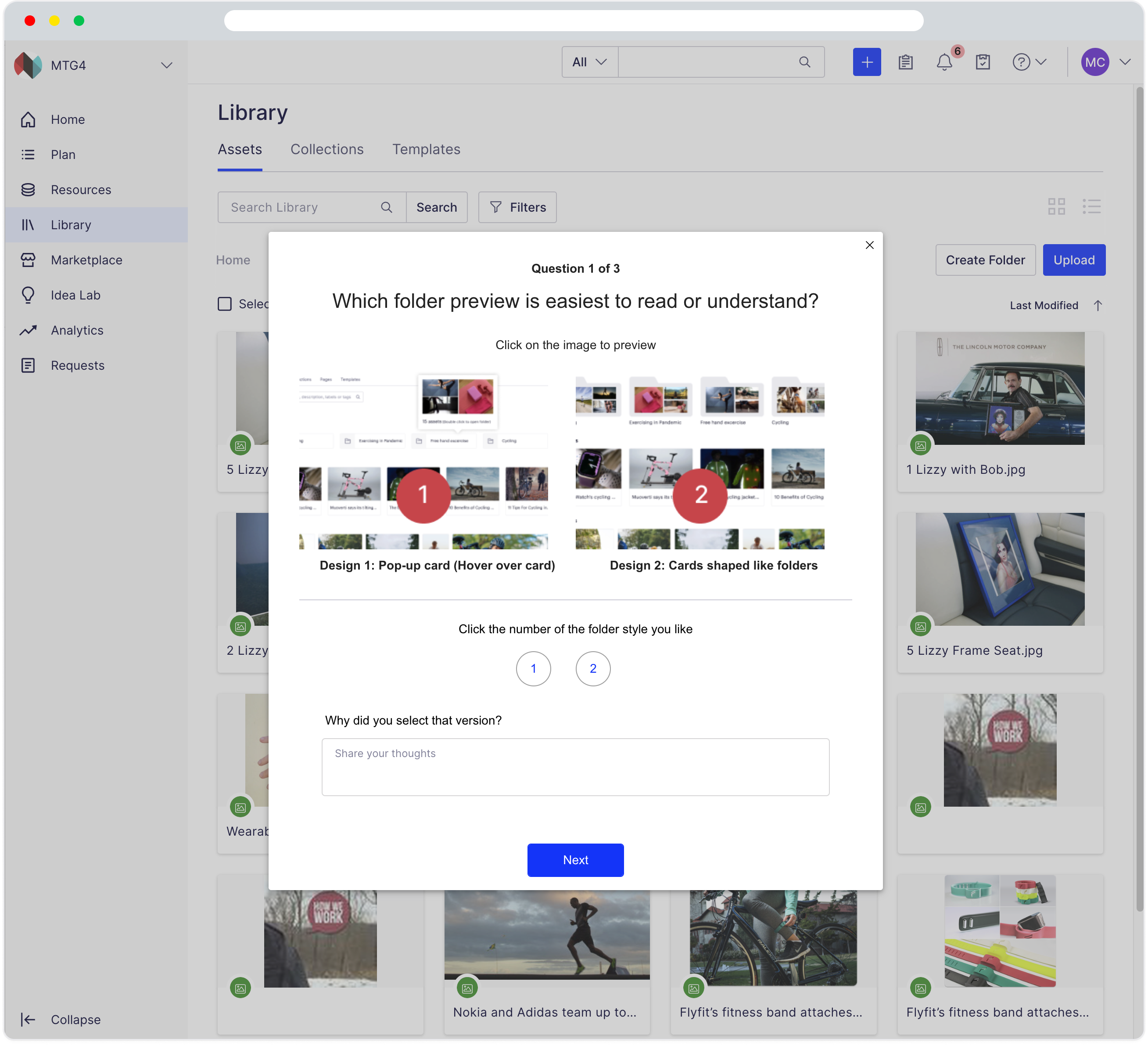
We were delighted when we saw users are jumping to answer our questions, they commented about their selection, they asked us to implement features we are showing here, as soon as possible. I think this was the biggest win in this whole process to let our users know that we are thinking about making their life a bit better.
The test had three parts.
- Testing different folder view
- Test search result page
- Finally tested asset card designs
When we get back results we were surprised to find out one answer. It’s about folder preview, the one we felt is old school, not industry-standard that one got the most votes so we obeyed their choice and implement that.
Between the other two, one was expected. And another proved our previous assumption via usabilityhub.But we felt good to get feedback from our users.
Finally we have a design for MVP.
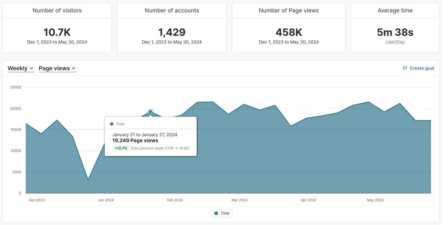
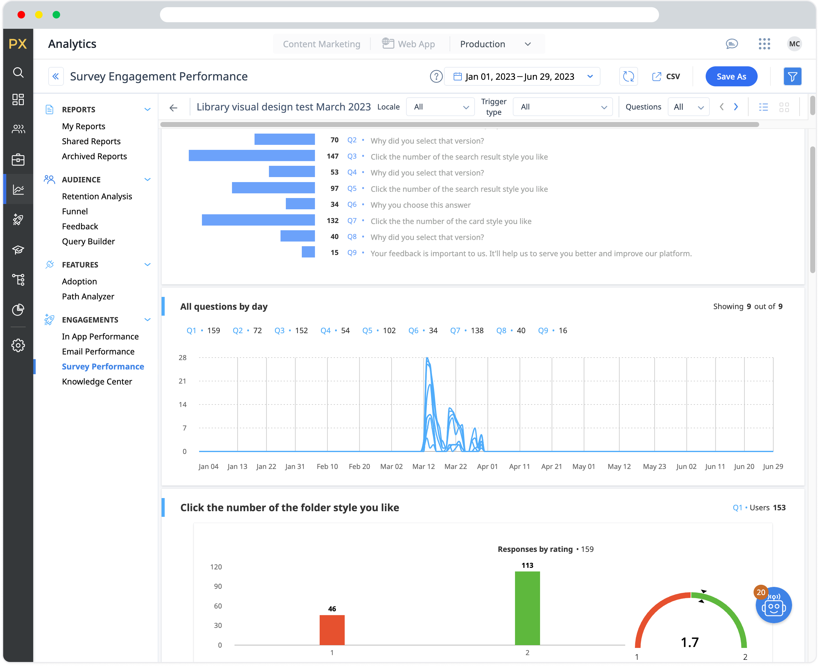
Measure
Our users use of the DAM raise significantly, here is a screenshot of the measure from our analytics software Pendo