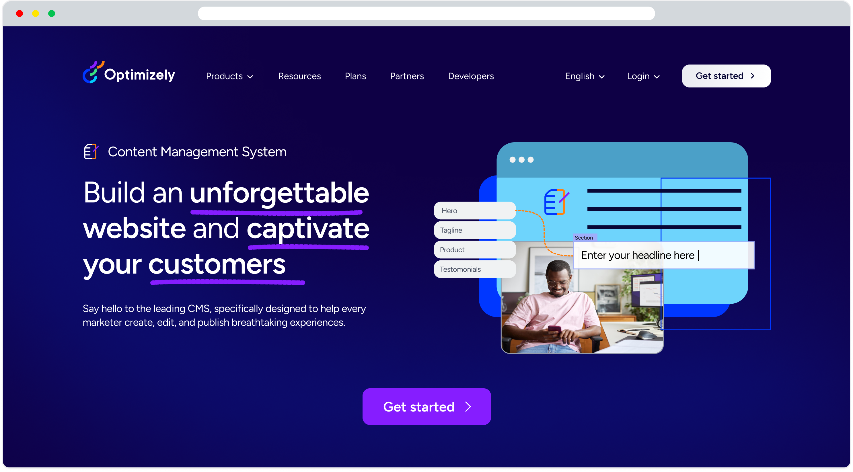
Optimizely CMS marketing website redesign
The CMS marketing website required a redesign, so I explored various design options for the page. While my primary focus is on product design, I took on this project as an experiment to apply my skills to a marketing website.
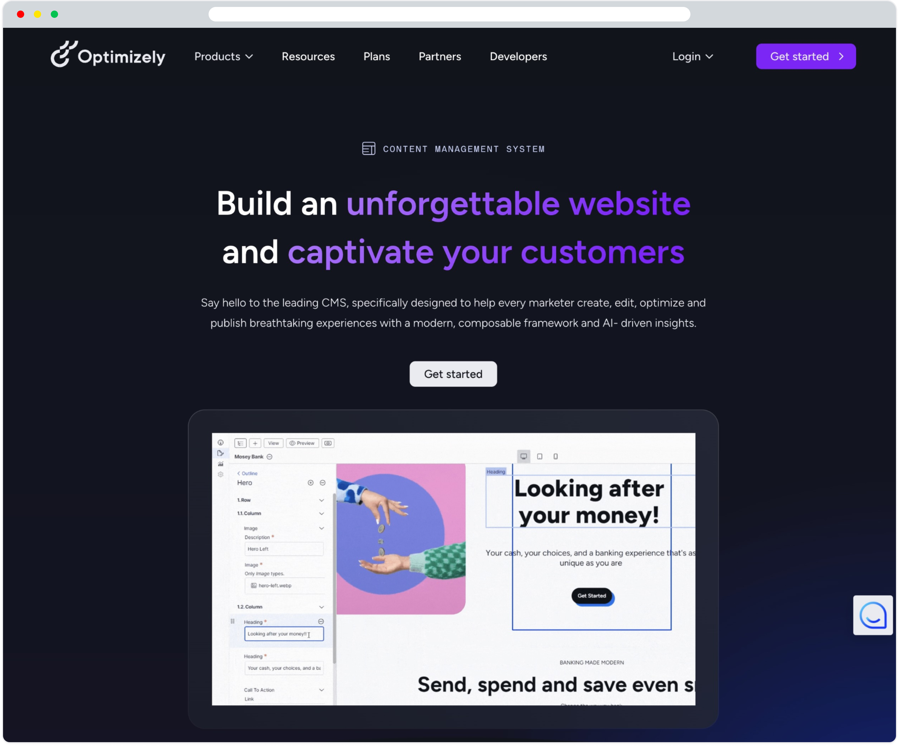
Previous Design
Process
Since this was a personal project, I couldn't follow a full-fledged design process. However, I adhered to a fundamental design methodology:
- Heuristic Evaluation
- I conducted a quick review of the existing website to identify UX and design issues.
- Competitor Research
- Using Gartner, I analyzed similar competitors, such as Contentful and Adobe Experience Manager, to gather design inspiration and best practices.
- Page Designs
- I created multiple design options for the webpage, preparing them for potential peer review.
- Peer Review
- Typically, I would present the designs to my peers for feedback and refinement. However, this step was optional for this project.
- A/B test
- In a real-world scenario, once the development phase is complete, A/B testing would be conducted to determine which design performs best.
Heuristics evaluation
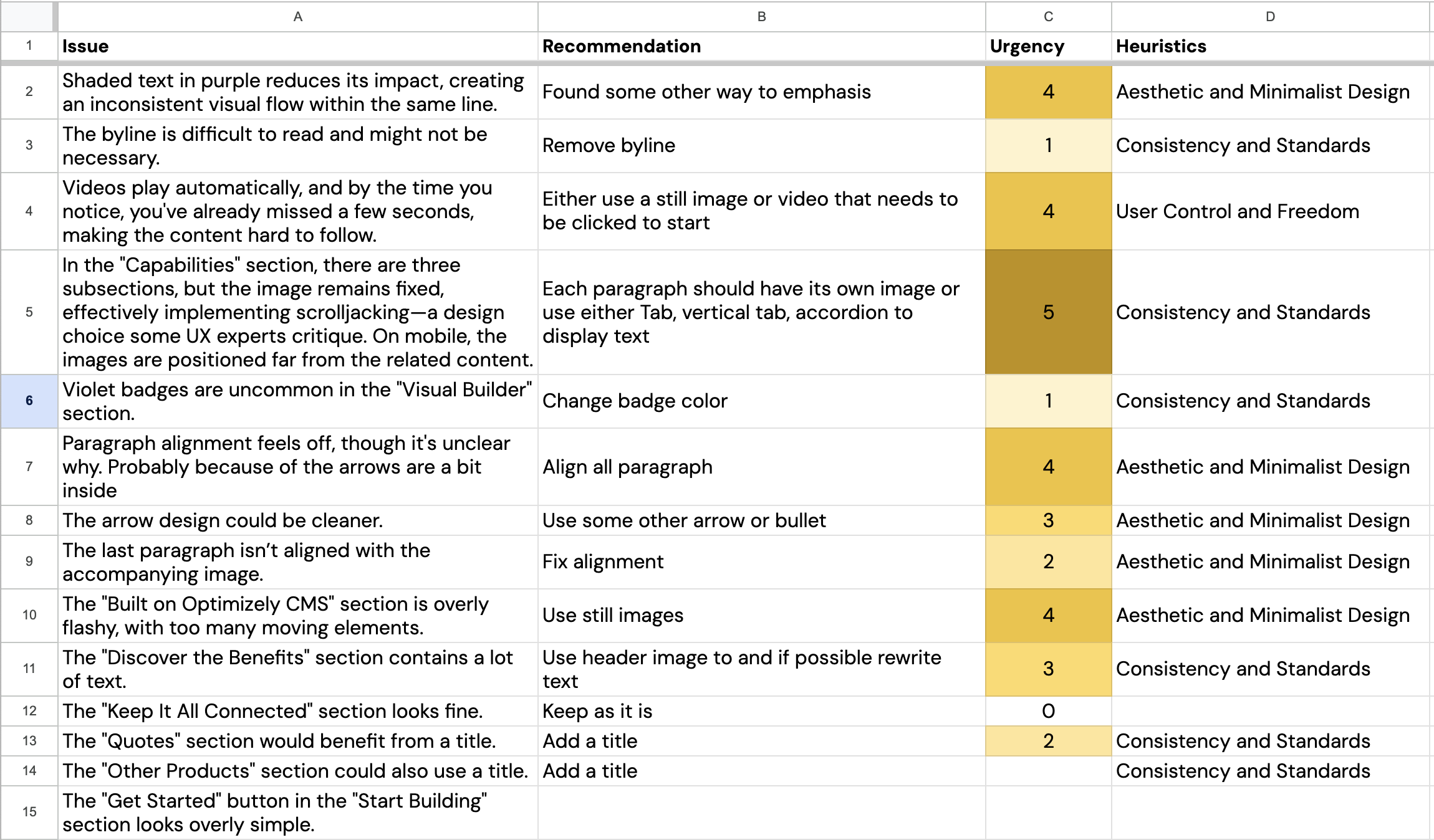
I reviewed the previous website and documented my evaluations and recommendations in a spreadsheet.
Competitor Research
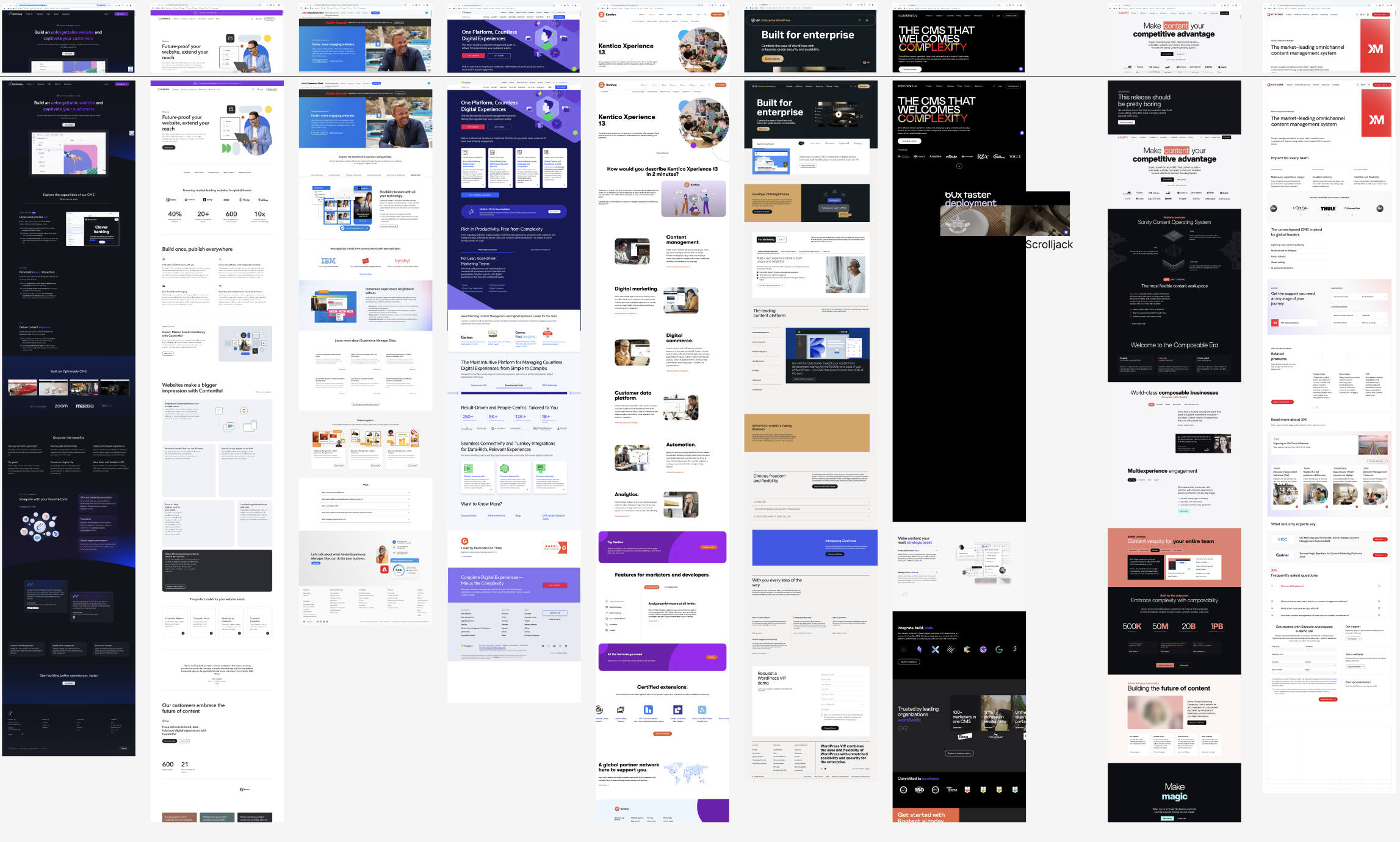
For research, I explored competitor websites via Gartner. I identified key players in the industry, such as Contentful and Adobe Experience Manager, and took screenshots of their designs to analyze trends. Some key findings included:
- "Capabilities" or "Benefits" sections vary in presentation: some use long lists similar to ours, while others incorporate columns, accordions, or tabs. One competitor even uses scroll-jacking.
- Several websites highlight key points by using brand-colored text.
- Background choices differ: five websites use white, two use black, and one uses blue.
Page Design Options
Based on my research, I developed four distinct design concepts:
-
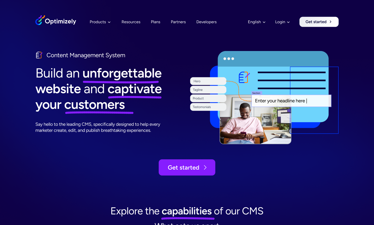
Design option 1 - Introduced navy blue, a brand color, to create a more professional feel compared to the current black theme.
- Used a single hero image for clarity.
- Designed the "Capabilities" section with a three-column layout.
-
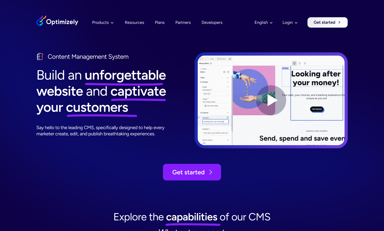
Design option 2 - Incorporated a hero video instead of a static image.
- Introduced a tabbed view for the "Capabilities" section, allowing users to focus on one item at a time.
- Proposed a one-minute hero video explaining the product in detail.
-
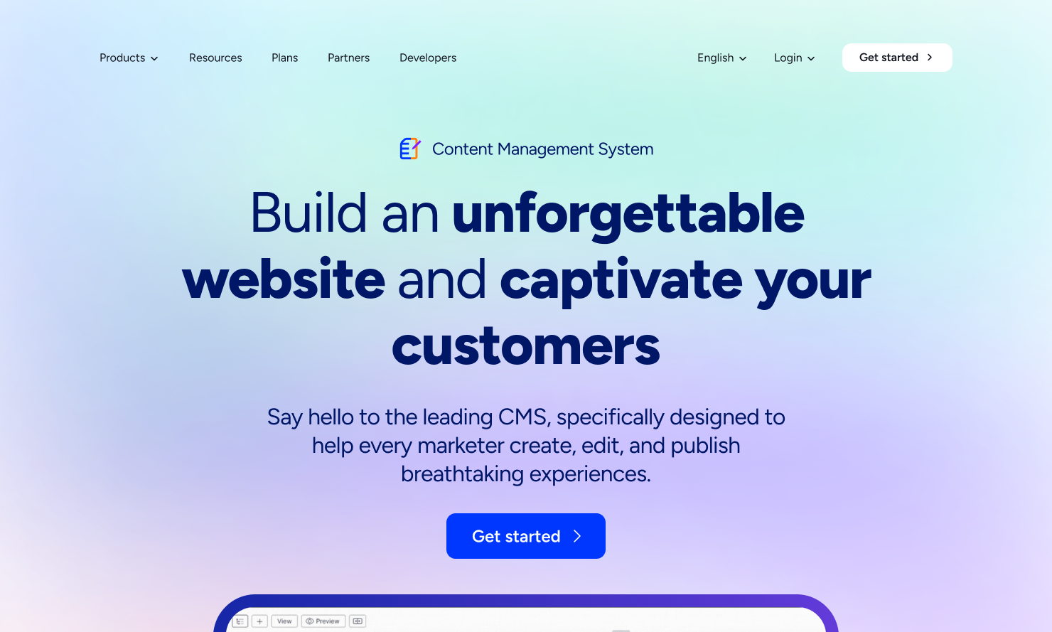
Design option 3 - Used a gradient background with lighter tones for a modern look.
- Leveraged large fonts and a single-column layout for the hero section.
- Designed a vertical tab or accordion layout for the "Capabilities" section, which could function as an automatic slideshow.
-
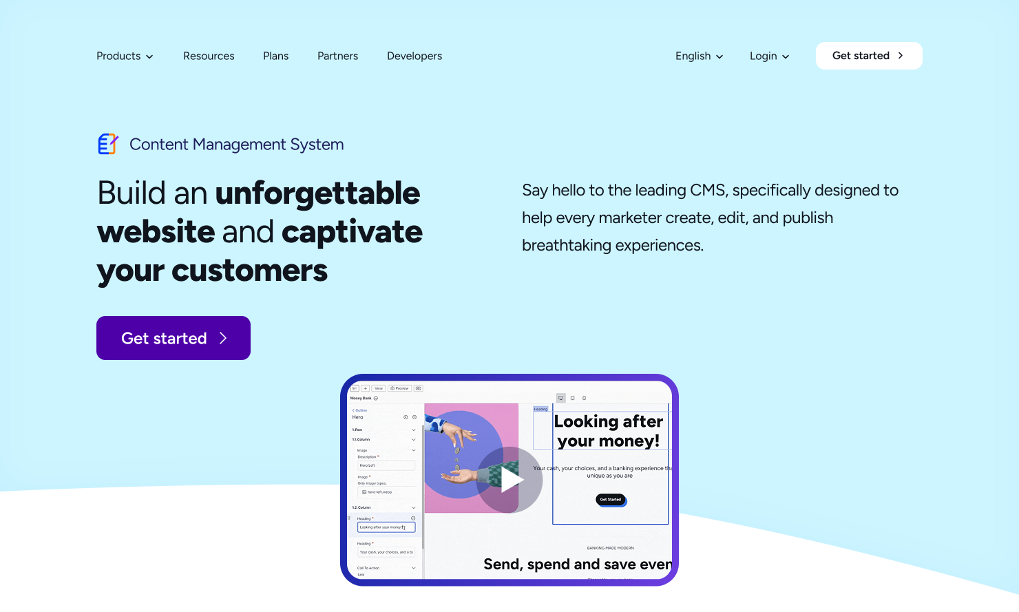
Design option 4 - Maintained the existing design’s core structure but refined it for a lighter feel.
- Created a split-layout hero section with a video positioned at the bottom.
- Implemented a free-flowing list in the "Capabilities" section for better adaptability.
Other Steps
Since I was not going to push it to production I didn't have to do the stems peer review and A/B testing. However in any production site I would do those steps and then finalize one.

