Product Recommendation suite - Self service widgets
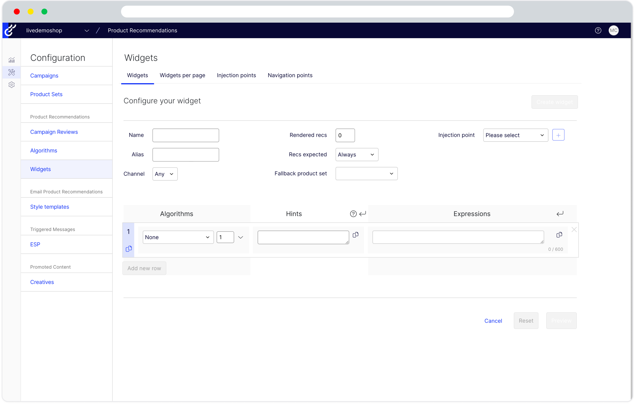
The challenge was to modernize the outdated Optimizely Recommendation software by improving its UX and usability to transition it from a managed solution to a self-service platform, beginning with its widget management.
Overview
Optimizely Recommendation is a product, a part of its personalization offering. This software was brought back in 2016 when Optimizely acquired Peerius.
Problem was the software looked a bit old and it had never been updated and mostly was a managed solution. We wanted to fix the UX and usability problems of the software so it no longer needed to be managed and become self service.
We started with a small but important part of the app, its widget management.

Team
Our product recommendation team is multinational and geographically diverse, with me as the product designer based in Dhaka, our PM in the USA, and the development team in Vietnam.
Discover & Define
My work starts with knowing all about the ability of the software, which requires hours of meetings with the PM and the two veterans of the product who know a lot about this product. Familiarizing myself with the terms, knowledge of how it works and creating a user flow of the app.
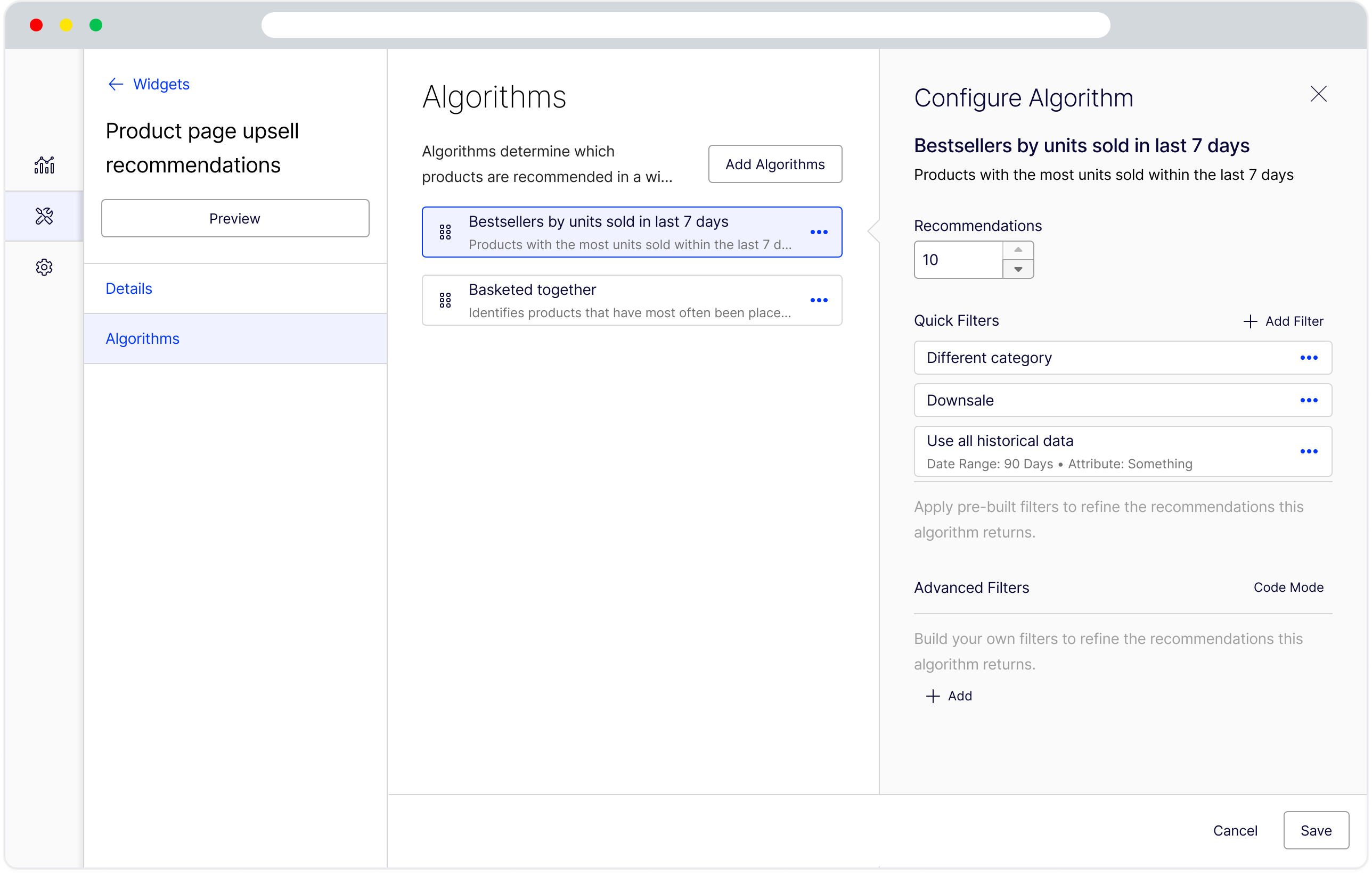
My PM and I have made a plan to update the design of the widget management system, which is the core of the app and involves managing algorithms that drive the widgets. We will test the solution with some users and I will provide a prototype to the developers based on the Optimizely design system.
However this was new to me as well since I joined as a part of the accusation of the Welcome company, I’ve never worked on this design system hands on.
Design & Testing
Throughout this process, I created three versions of prototypes. After developing the first prototype, I presented it to the larger team to gather usability and design system feedback from more experienced designers in the company, which informed my second iteration.
For the second iteration, we aimed to conduct unmoderated tests. I collaborated with our research team to recruit users for feedback, which was the most challenging part. Eventually, we found participants and ran the tests. The overall feedback was positive, with some suggestions for improvement.
While we waited for the test results, our developers continued working on the backend and some frontend components. During this time, we identified some issues, leading me to design the third version with minor changes and additional detailed designs for the developers.
Finally, we began building from the design for the Alpha release. Here is the Figma animation of the solution.

